Basic Plotting Guide
The plotting tool in pyspeckit is intended to make publication-quality plots straightforward to produce.
For details on the various plotting tools, please see the examples and the
plotter documentation.
A few basic examples are shown in the snippet below, with comments describing the various steps:
import numpy as np
from astropy import units as u
import pyspeckit
xaxis = np.linspace(-50,150,100.) * u.km/u.s
sigma = 10. * u.km/u.s
center = 50. * u.km/u.s
synth_data = np.exp(-(xaxis-center)**2/(sigma**2 * 2.))
# Add noise
stddev = 0.1
noise = np.random.randn(xaxis.size)*stddev
error = stddev*np.ones_like(synth_data)
data = noise+synth_data
# this will give a "blank header" warning, which is fine
sp = pyspeckit.Spectrum(data=data, error=error, xarr=xaxis,
unit=u.erg/u.s/u.cm**2/u.AA)
sp.plotter()
sp.plotter.savefig('basic_plot_example.png')
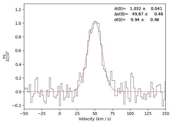
# Fit with automatic guesses
sp.specfit(fittype='gaussian')
# (this will produce a plot overlay showing the fit curve and values)
sp.plotter.savefig('basic_plot_example_withfit.png')
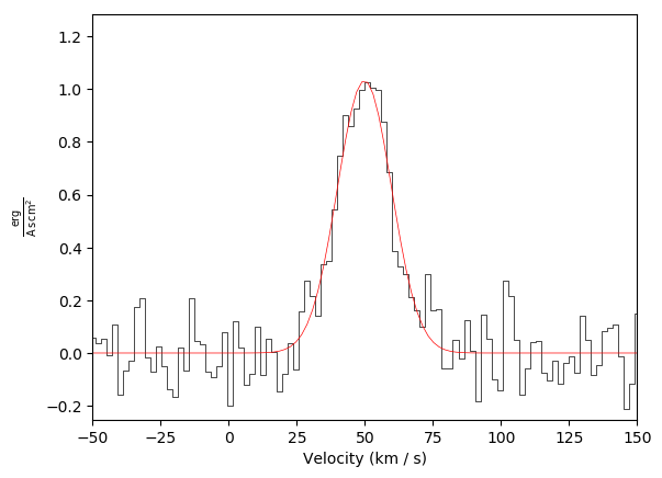
# Redo the overlay with no annotation
# remove both the legend and the model overlay
sp.specfit.clear()
# then re-plot the model without an annotation (legend)
sp.specfit.plot_fit(annotate=False)
sp.plotter.savefig('basic_plot_example_withfit_no_annotation.png')
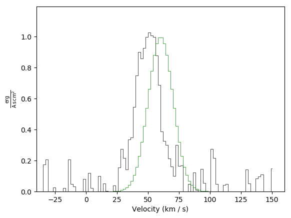
# overlay another spectrum
# We use the 'synthetic' spectrum with no noise, then shift it by 10 km/s
sp2 = pyspeckit.Spectrum(data=synth_data, error=None, xarr=xaxis+10*u.km/u.s,
unit=u.erg/u.s/u.cm**2/u.AA)
# again, remove the overlaid model fit
sp.specfit.clear()
# to overplot, you need to tell the plotter which matplotlib axis to use and
# tell it not to clear the plot first
sp2.plotter(axis=sp.plotter.axis,
clear=False,
color='g')
# sp2.plotter and sp.plotter can both be used here (they refer to the same axis
# and figure now)
sp.plotter.savefig('basic_plot_example_with_second_spectrum_overlaid_in_green.png')
# the plot window will follow the last plotted spectrum's limits by default;
# that can be overridden with the xmin/xmax keywords
sp2.plotter(axis=sp.plotter.axis,
xmin=-100, xmax=200,
ymin=-0.5, ymax=1.5,
clear=False,
color='g')
sp.plotter.savefig('basic_plot_example_with_second_spectrum_overlaid_in_green_wider_limits.png')
# you can also offset the spectra and set different
# this time, we need to clear the axis first, then do a fresh overlay
# fresh plot
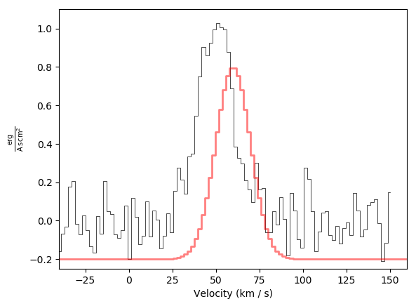
sp.plotter(clear=True)
# overlay, shifted down by 0.2 in y and with a wider linewidth
sp2.plotter(axis=sp.plotter.axis,
offset=-0.2,
clear=False,
color='r',
linewidth=2,
alpha=0.5,
)
# you can also modify the axis properties directly
sp.plotter.axis.set_ylim(-0.25, 1.1)
sp2.plotter.savefig('basic_plot_example_with_second_spectrum_offset_overlaid_in_red.png')
Basic plot example:

Basic plot example with a fit and an annotation (annotation is on by default):
Basic plot example with a fit, but with no annotation:
Basic plot example with a second spectrum overlaid in green:
Basic plot example with a second spectrum overlaid in green plus adjusted limits:

Basic plot example with a second spectrum offset and overlaid in red, again with adjusted limits: